POSTERBOY 20X20

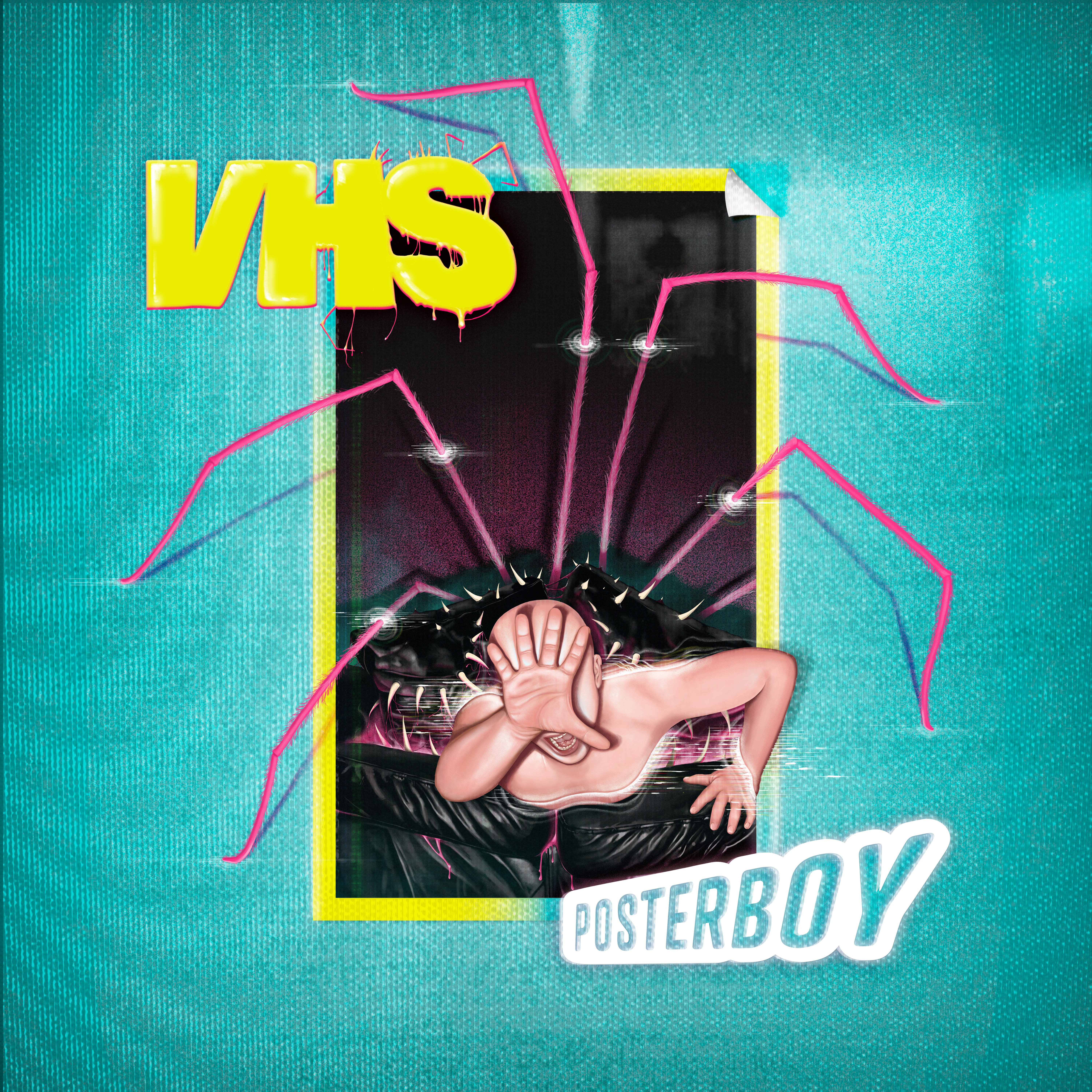
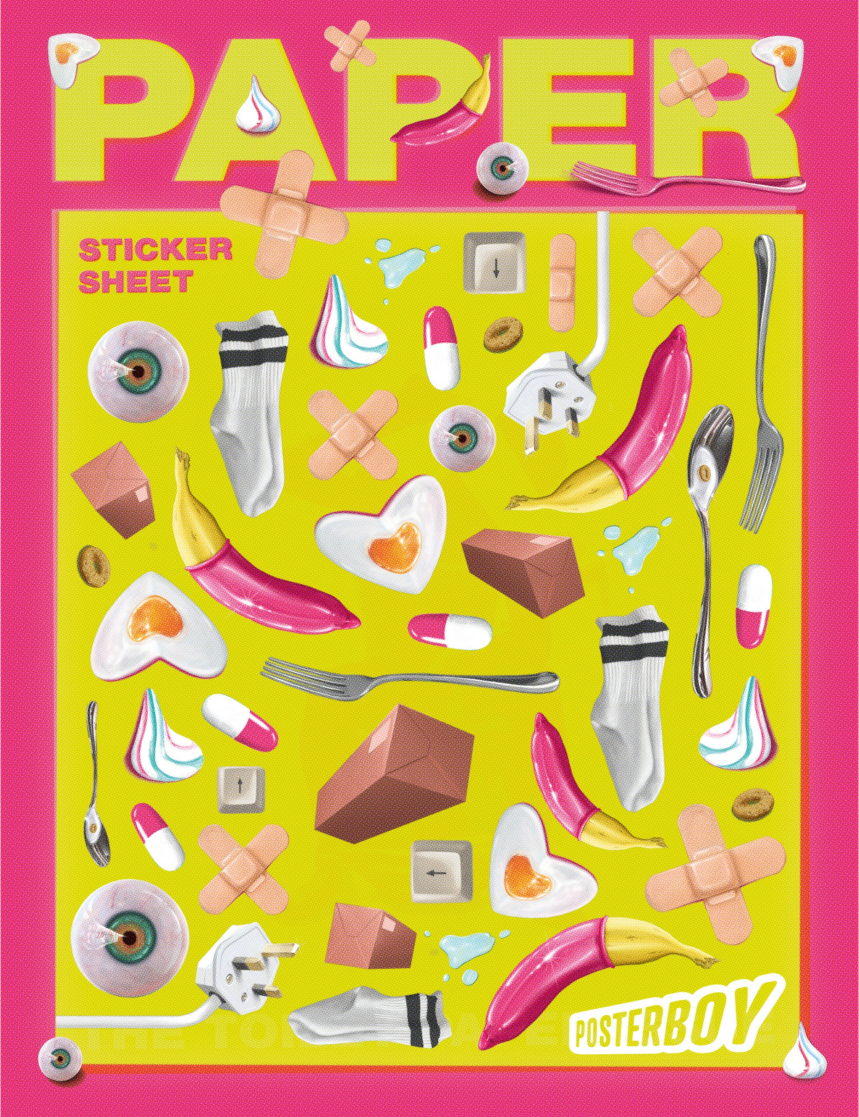
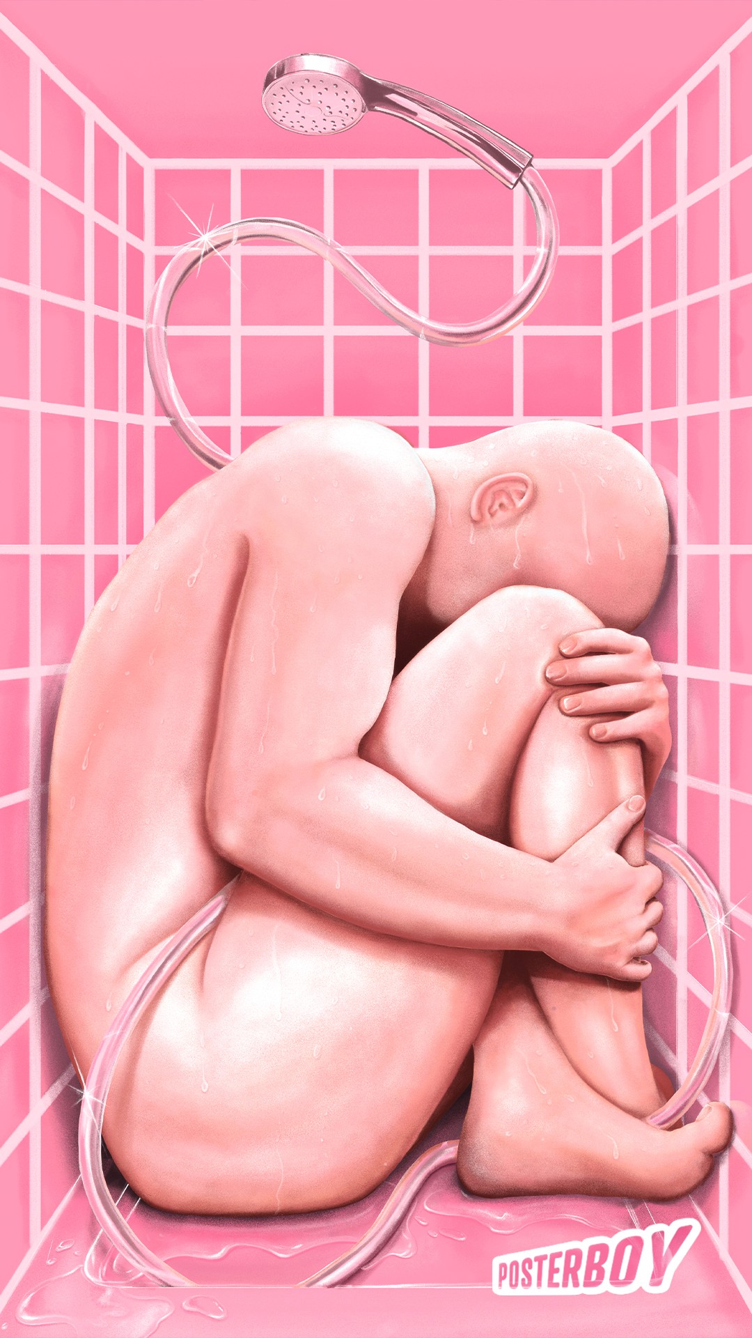
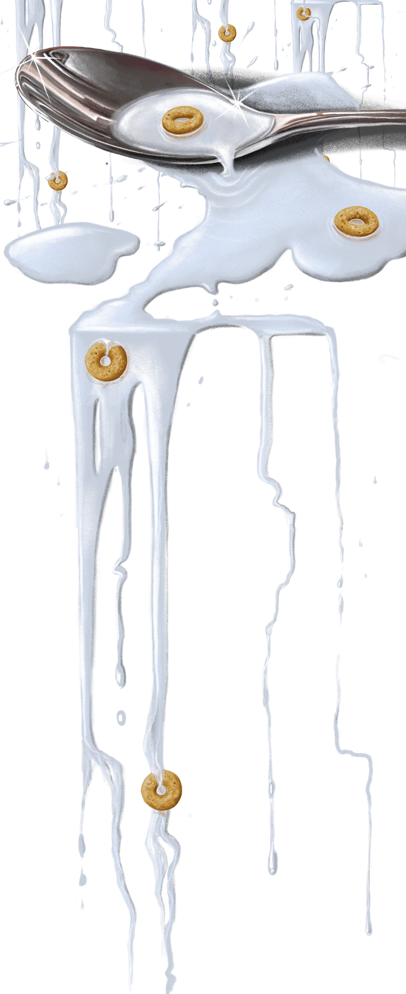
20X20 is an album I wrote in response to the COVID-19 pandemic. With lots of time I wanted to explore through my music and my visuals this rollercoaster of a journey we as a society went through. I developed accompanying visuals that contrasted hyperrealism with surrealism. Taking everyday objects of this faceless character of Posterboy and making the viewer see them in a completely new and exciting way. I decided to move away from an initial photography based artwork because I could not achieve the strange compositions and defy physics as I wanted to. For this reason I chose to illustrate all of the visuals for the album. I was inspired by classic film posters, both compositionally and in the hyperrealist illustration style like Drew Struzan. His work plays with light and dark and brings together a powerful story into one image. With the Posterboy character watching American cinema religiously growing up, Struzan’s posters no doubt were part of inspiration to undertake his pilgrimage to America. He expected to become the guy in the poster. Struzan’s compositions are made up from the film’s characters, a complex and perfectly balanced composition which draws the viewers eye around. Tiny details within his posters provide an insight into the story and characters of the film, I was inspired to do the same for the visuals of 20X20.
Taking the idea that a person’s belongings can reveal much about who they are, the album cover uses elements from around Posterboy’s flat to tantalise potential listeners of the strangely familiar, yet surreal world of 20X20. Just as Struzan’s compositions are perfectly balanced and draw the viewer’s eye through the image, I hoped mine would do the same. I sketched out the album cover with all of its elements until I was happy with the composition. I then drew each section of the cover individually to ensure each element could be as hyperrealistic as possible.
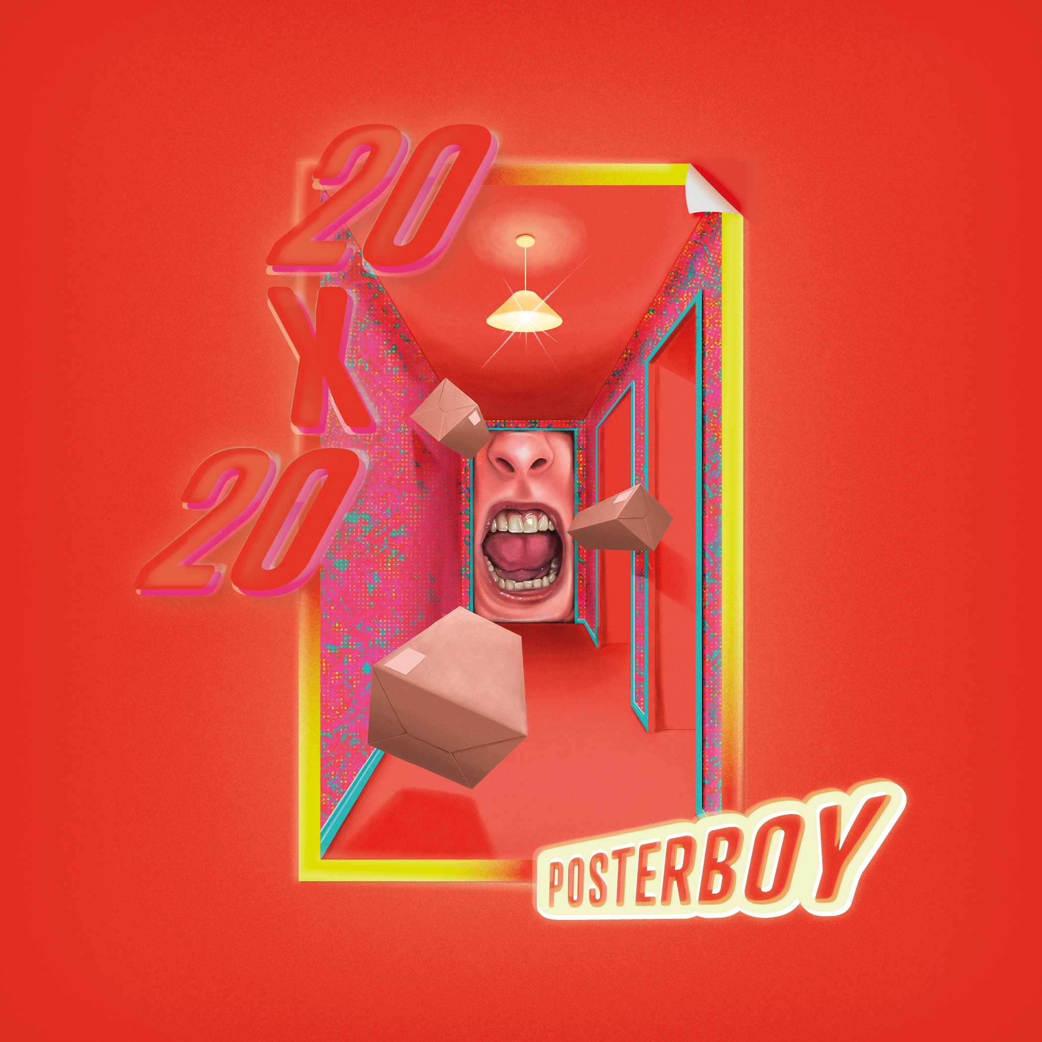
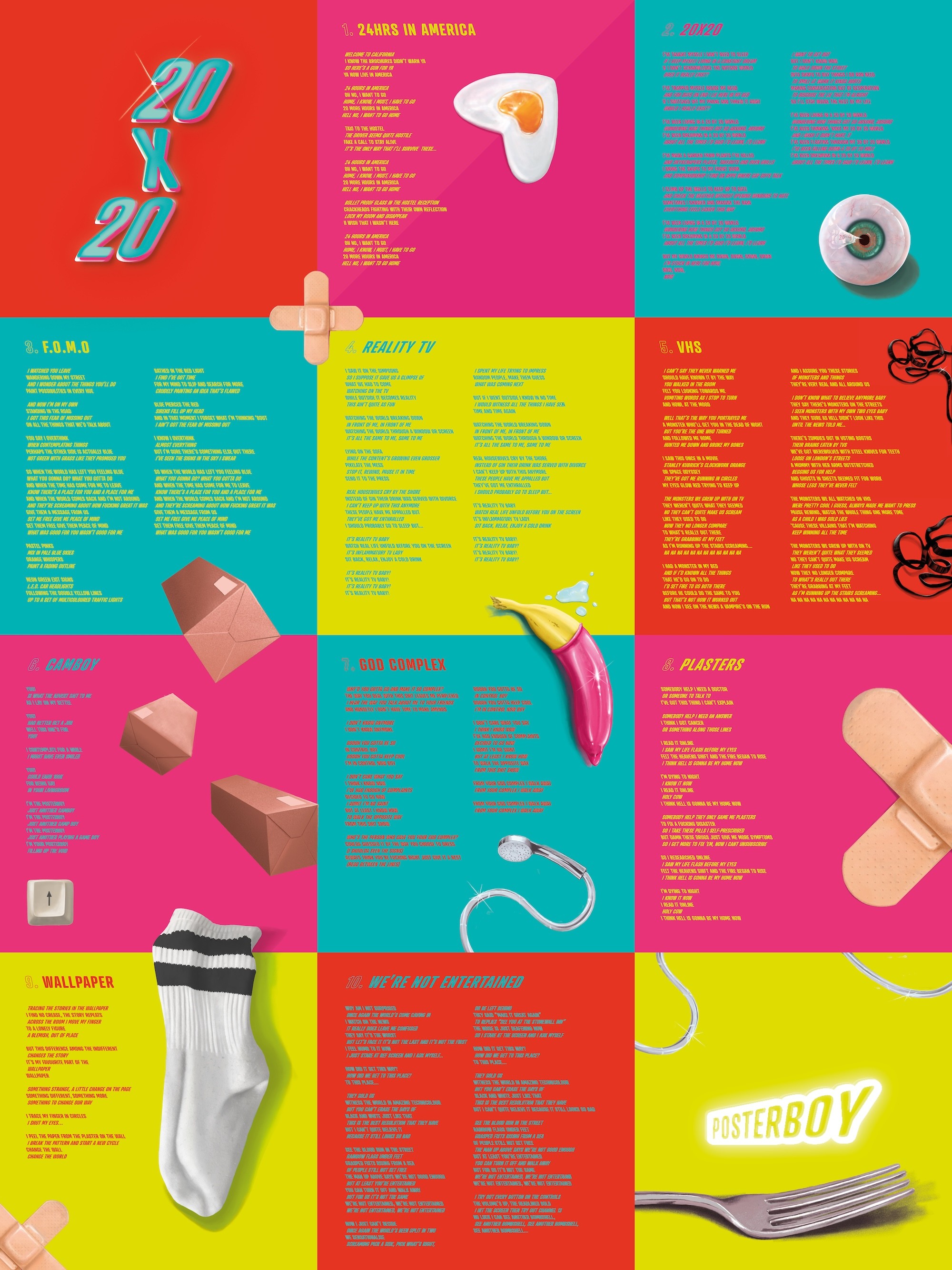