


Still Life asks, is what is supposed to connect us on a worldwide scale being used more for vanity/ego, distraction or even surveillance/control? “Look at it breed, modern greed…”. It’s a bit of a cautionary tale, much like 1984…if you get my drift. Still though, there are glimmers of hope – “I’ve got the seed in my pocket….” as in I’ve got seeds to sow, seeds to grow. Small gestures can make big changes. The title track explores the irony of being more connected than ever through screens, yet using them primarily for vanity, distraction, or surveillance. It is described as a "cautionary tale" exploring the tension between digital existence and real life.
Working closely with Lucinda we wanted to create art direction that captured the mundanity of life coming to a standstill. Playing with digital elements and graphics we find in the supermarket, a space that had became a place of health anxiety. I thought receipts and fruit stickers presented some interesting contrast to one another, one being a variety of shapes and colours, the other simple, structured and black and white. Piles of fruit stickers, like daily markers. In the printing of the vinyl packaging I wanted to capture this feeling of the stickers being different from the rest of the packaging, as if being stuck on. To achieve this I used spot gloss over the ‘stickers’ which created a different texture to the matte finish of the product which brought the concept to life.


the process
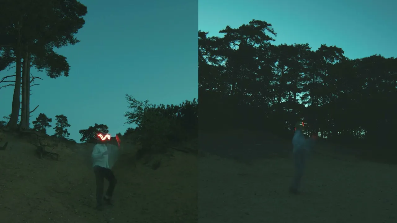
I presented a series of routes to the band after our initial discussions and mood boards. One exploring digital life, digital art and classic painting. The contrast between painterly backgrounds with digital screens and Microsoft Paint. Another taking digital layering and glitching with postal stamps, contrasting forms of communications. Wordart-esque vibes contrasting with the incredible photography by Tami Aftab. Below you can explore some of this process, experimenting with layouts, styles and crops.
Fruit became a particular motif that we developed, in particular the lemon. In reference to ‘when life gives you lemons, make lemonade’. This then developed further post-release with the artworks for the remixes.


