

Lava La Rue has one of the most distinct personas in the scene of UK music. The West London multi-hyphenate stands as a true manifestation of modern British culture. The result of a melting pot that draws in countless cultural backgrounds alongside experimental and DIY forms of creative production. Through which we have now been bestowed with ‘Hi-Fidelity’.
Made between London and LA, 'Hi-Fidelity is a five-track EP that explores queer romance through heady and uplifting sounds, drawing on Lava La Rue’s broad and dynamic influences the release presents as an incredibly welcome follow-up to their psych-rap infused second EP ‘Butter-Fly’. Lava states “I want to drop one last project that acts as the bridge between the Lava that debuted, the one everyone knows, and the person I’m becoming." - CLASH
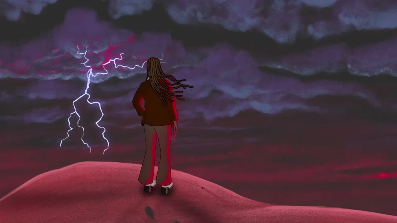
I worked alongside Lava and illustrator River Cousin to develop a rich grimy and funky visual landscape for the incredible music to live within. Working on the graphic language and expanding the illustrative world in promotional material and animated music videos. Inspired by Lava’s love for anime, storytelling and queerness.
Lava La Rue has one of the most distinct personas in the scene of UK music. The West London multi-hyphenate stands as a true manifestation of modern British culture. The result of a melting pot that draws in countless cultural backgrounds alongside experimental and DIY forms of creative production. Through which we have now been bestowed with ‘Hi-Fidelity’.
Made between London and LA, 'Hi-Fidelity is a five-track EP that explores queer romance through heady and uplifting sounds, drawing on Lava La Rue’s broad and dynamic influences the release presents as an incredibly welcome follow-up to their psych-rap infused second EP ‘Butter-Fly’. Lava states “I want to drop one last project that acts as the bridge between the Lava that debuted, the one everyone knows, and the person I’m becoming." - CLASH
I worked alongside Lava and illustrator River Cousin to develop a rich grimy and funky visual landscape for the incredible music to live within. Working on the graphic language and expanding the illustrative world in promotional material and animated music videos. Inspired by Lava’s love for anime, storytelling and queerness.


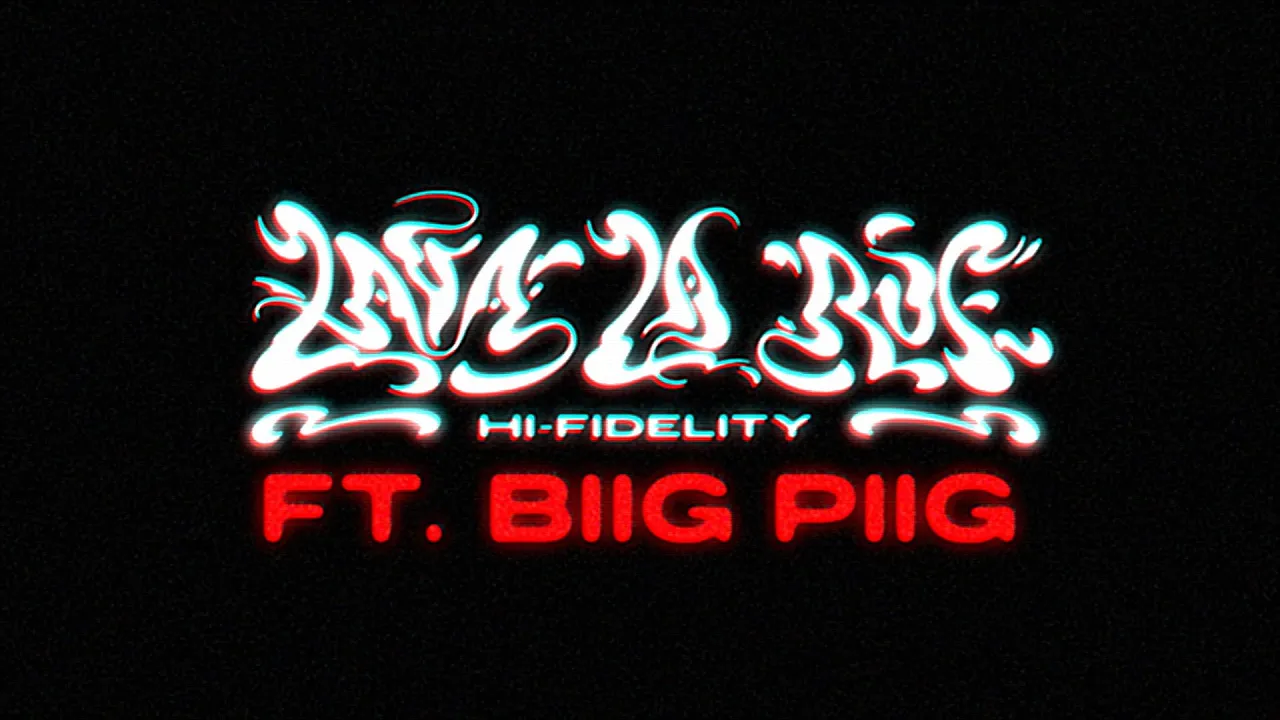
The process of developing a visual language for the EP began with me experimenting with illustrations inspired by Lava’s visual inspirations. With the butterfly motif being prominent in their previous work I initially developed a logo based on the shape of a butterfly and bright bold colours. As mastering of the EP wrapped up Lava sought to take the visuals in a new direction, discovering the brilliant illustrator River Cousin. We brought River in and they developed three artworks for the EP and two singles. Alongside this process I worked with Lava to develop a new logo more suited to the campaign, taking inspiration from retro sci-fi movies, psychedelic typography and heavy metal. Below is a snapshot of some of this process.
The process of developing a visual language for the EP began with me experimenting with illustrations inspired by Lava’s visual inspirations. With the butterfly motif being prominent in their previous work I initially developed a logo based on the shape of a butterfly and bright bold colours. As mastering of the EP wrapped up Lava sought to take the visuals in a new direction, discovering the brilliant illustrator River Cousin. We brought River in and they developed three artworks for the EP and two singles. Alongside this process I worked with Lava to develop a new logo more suited to the campaign, taking inspiration from retro sci-fi movies, psychedelic typography and heavy metal. Below is a snapshot of some of this process.
The process of developing a visual language for the EP began with me experimenting with illustrations inspired by Lava’s visual inspirations. With the butterfly motif being prominent in their previous work I initially developed a logo based on the shape of a butterfly and bright bold colours. As mastering of the EP wrapped up Lava sought to take the visuals in a new direction, discovering the brilliant illustrator River Cousin. We brought River in and they developed three artworks for the EP and two singles. Alongside this process I worked with Lava to develop a new logo more suited to the campaign, taking inspiration from retro sci-fi movies, psychedelic typography and heavy metal. Below is a snapshot of some of this process.
The process of developing a visual language for the EP began with me experimenting with illustrations inspired by Lava’s visual inspirations. With the butterfly motif being prominent in their previous work I initially developed a logo based on the shape of a butterfly and bright bold colours. As mastering of the EP wrapped up Lava sought to take the visuals in a new direction, discovering the brilliant illustrator River Cousin. We brought River in and they developed three artworks for the EP and two singles. Alongside this process I worked with Lava to develop a new logo more suited to the campaign, taking inspiration from retro sci-fi movies, psychedelic typography and heavy metal. Below is a snapshot of some of this process.


